Lithostone colours: how to choose the right look (and what it means for your build)
Lithostone colours: how to choose the right look (and what it means for your build)
Choosing a Lithostone colour is easier when you focus on the job first, then the look. In most homes, the best choice is the one that suits your fixed finishes, works in your lighting, and won’t blow out your schedule.
This guide covers what matters in South East Queensland (SEQ): daylight, stock availability, joins, and day-to-day practicality.
Quick answer: the simplest way to choose
Lock in your fixed items first, then pick a colour family, then shortlist 2–3 colours.
Work through this order:
- Fixed finishes: floors, wall colour, feature timber
- Cabinet colour and style: shaker, flat-panel, two-tone
- Lighting: warm vs cool LEDs + natural light
- Look family: veined marble-look, concrete grey, speckle/terrazzo, solid
- Practicality: crumbs, water spots, fingerprints, scratch visibility
- Fabrication: joins, cut-outs, waterfall ends, edge profile, thickness
Once these are clear, the “right” colour is usually obvious.
SEQ reality check: stock affects install dates
In SEQ builds, timelines often tighten around cabinet install.
Benchtops can’t be templated until cabinets are installed and fixed. Installs then need to happen before splashbacks and final fit-off.
If you choose a regularly stocked colour (often called a Builders Range), you reduce the risk of supplier delays and last-minute colour changes.
Start with the job (not the colour name)
A small sample can look perfect, but a benchtop is a big surface that catches light all day.
Before you lock anything in, confirm:
- Where is it going? Kitchen, vanity, laundry, BBQ area
- What thickness look? 20mm or a 40mm look (usually a mitred edge, not a full 40mm slab)
- What finish? Polished or honed/matte
If you want to browse first: Lithostone range.
Availability can change your program
If you’re on a tight schedule, ask early what’s in stock in SEQ and what needs ordering.
You can often change taps or handles late. Changing stone late can delay templating, install, and splashback timing.
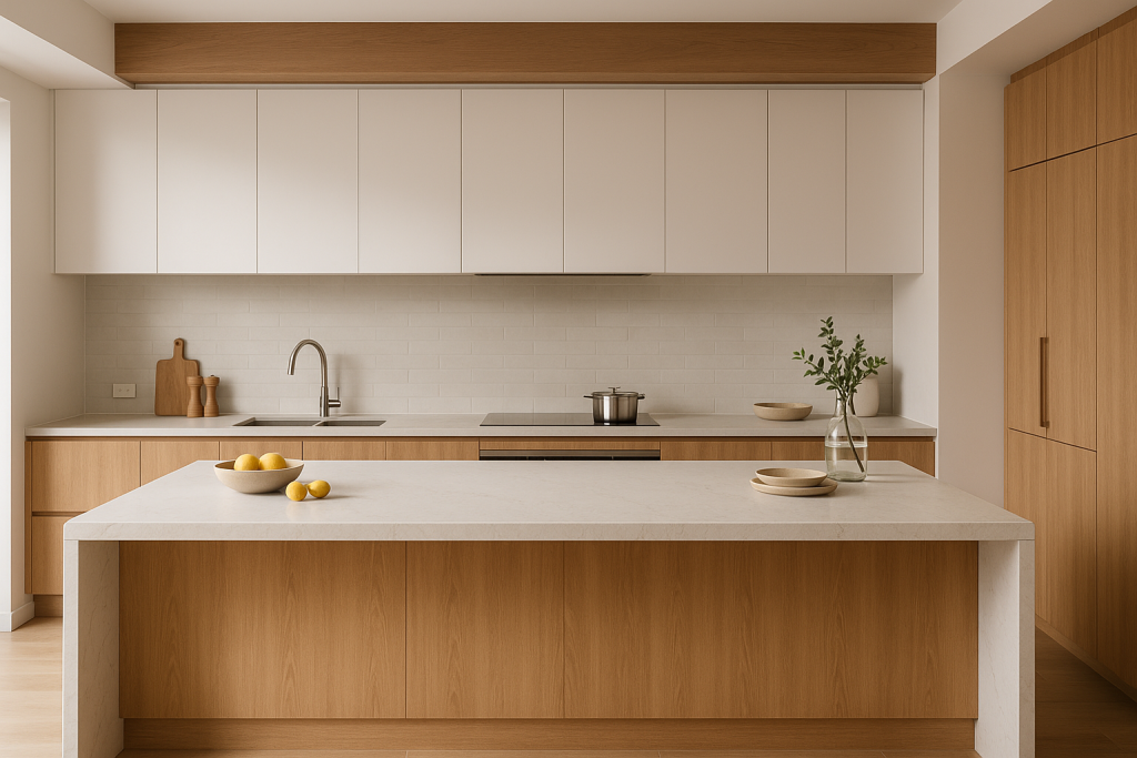
Lithostone colours by style (choose the family first)
Most Lithostone colours fit into a few practical style groups. Pick the group first, then narrow to 2–3 options.
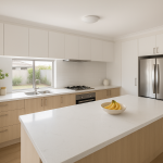
Clean whites and soft off-whites
Best for: bright kitchens, smaller spaces, timeless designs.
“White” isn’t one colour. The undertone matters.
What to watch
- Warm vs cool vs neutral whites
- Warm suits timber and beige tiles
- Cool suits crisp white cabinetry and grey floors
- Neutral is the safest with mixed finishes
- SEQ daylight: big windows can make whites feel cooler at home than in a showroom
- Night lighting: warm LEDs can pull whites towards cream
- Daily use: light tops hide dust well, but sink areas still show splashes and drying marks
Quick guidance
- Warm timber cabinetry (oak/blackbutt): choose warm or neutral off-white
- Crisp white cabinetry + chrome/black tapware: cooler whites can work, but check in your space
Common pairing
- White cabinets + soft off-white stone + brushed nickel tapware
Light greys and “concrete look” tones
Best for: modern builds, coastal neutrals, busy family kitchens.
Concrete-look greys are common in SEQ, especially with flat-panel cabinets.
What to watch
- Grey undertones vary (blue-leaning, warm-leaning, neutral)
- Matte/honed finishes suit concrete looks, but can show wipe marks in angled light
Practical SEQ note
If morning or afternoon sun hits across the bench, matte finishes can show “wipe paths” until fully dry. That’s normal and is usually more noticeable on darker or very uniform colours.
If you’re comparing brands: stone range options.
Veined marble-look patterns
Best for: feature islands, waterfall ends, high visual impact.
Veining changes how the whole kitchen reads, and it affects fabrication.
What veining changes
- Room “movement”: bold veins feel like a feature; subtle veins feel calmer
- Joins: obvious veins make join placement and alignment more important
- Waterfalls: you’ll usually want the vein to look continuous down the panel
- Cut-outs: sinks/cooktops interrupt the pattern, so layout matters
What to watch
- Vein scale: small samples can understate how bold it will look on a 3–4m island
- Vein direction: decide early (lengthways, across, or around a run)
- Mitred edges: a 40mm look needs careful alignment so it doesn’t look “broken”
- Splashbacks: full-height stone looks great, but needs planning for power points and wall straightness
Scheduling tip
Veined slabs can take longer to approve because layout decisions matter. Allow time for slab viewing and layout sign-off.
Speckle / terrazzo-look surfaces
Best for: family kitchens, relaxed coastal looks, laundries, “pattern without drama”.
These are popular in SEQ because they’re often forgiving day to day.
What to watch
- Often hides crumbs and minor smears better than flat solids
- Pattern scale: can look subtle up close but busy across a full island
- Undertones: white bases can still read warm or cool depending on the chip mix
- Joins and mitres: large chips near an edge can draw attention if they don’t land neatly
Simple way to choose
- Busy room (timber grain, patterned floors, feature tiles): pick smaller speckle and lower contrast
- Minimal room: you can go bolder with larger aggregate
- Keep the splashback calm so the benchtop stays the hero
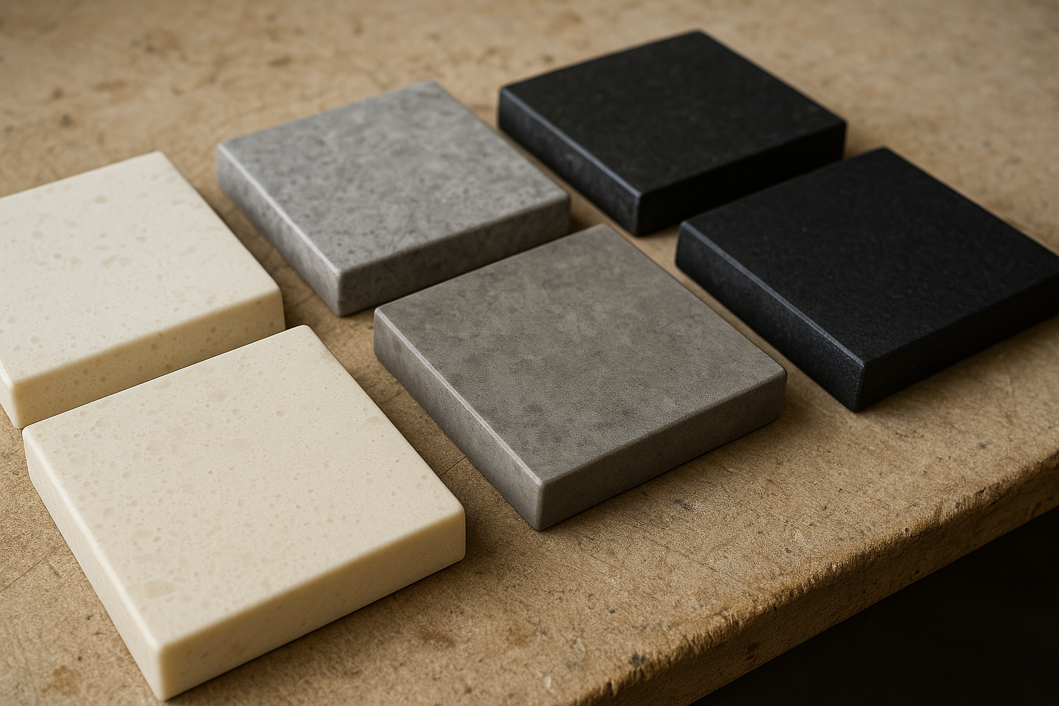
Solid colours (whites, greys and blacks)
Best for: minimal designs and the cleanest look.
What to watch
- Very pale solids: crisp, but show splashes around sinks and prep areas
- Mid-greys: often the best compromise for marks and maintenance
- Charcoal/black solids: striking, but show more
- crumbs and dust
- water spotting near sinks
- fingerprints on smooth finishes
- fine scratches catching light
If you want dark without constant visibility, choose charcoal with gentle movement.
Undertones and lighting (warm, cool, neutral) + metamerism
Lighting is why a showroom “perfect” colour can look different at home.
Undertones in plain English
- Warm: cream, beige, slight yellow
- Cool: blue, steel, crisp grey
- Neutral: in-between (often safest)
How to spot undertones (showroom or at home)
- Hold the sample next to something known warm (timber) and known cool (crisp white cabinet sample).
- Compare it to a true white sheet of paper.
- Check it under more than one light source.
SEQ-specific tip
Many Queensland homes have strong daylight and reflected light from patios, pools, and pale paving. That brightness can make whites feel cooler and greys lean bluer.
If you can, check a larger sample in your space and under your downlights.
Warm vs cool LEDs
- Warm LEDs: pull whites towards cream and soften greys
- Cool LEDs: make whites sharper and greys bluer
Metamerism (why matches shift)
Metamerism is when a colour matches under one light, then shifts under another (for example, cool showroom lighting vs warm home downlights).
What to do
- View a slab or larger sample in your home
- Put it next to cabinet and flooring samples
- Check morning, midday, and night
Pattern direction and repeat (what it means for joins and islands)
With patterned Lithostone colours, you’re choosing a layout as well as a colour.
- Direction: whether the pattern runs along the island, across it, or wraps to a waterfall
- Repeat: engineered patterns can repeat across a slab (more noticeable on big islands)
Why it matters
- Joins: patterns rarely match perfectly unless planned
- Waterfalls: best results come from planning vein flow through the mitre
- Cut-outs: sinks, bins, and cooktops break the pattern, so place the best section where you’ll see it most
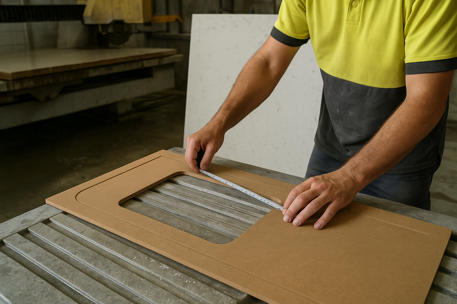
Slab and batch variation (why samples don’t always match)
Engineered stone is consistent, but variation still happens, especially in veining and patterns.
Variation can include
- veins thicker/thinner or in different positions
- speckle/aggregate denser or more spaced
- base tone slightly warmer or cooler
A simple process to avoid surprises
- Shortlist 2–3 colours
- View full slabs where possible (especially for veining)
- Reserve the slab(s) once you’re happy
- Approve layout photos before cutting
- Allow tolerance: joins and cut-outs always interrupt patterns
Finishes: polished vs honed/matte
Finish changes how the colour looks and what marks you notice.
Polished
- deeper colour and clearer pattern
- more reflective under downlights
- wipe marks tend to disappear faster
- fingerprints can be less obvious than on some matte colours
Honed / matte
- softer look and less reflective
- can show fingerprints and “shadow smears” more on some colours
- can show wipe paths in side light until fully dry
- can soften contrast in veining and speckle
If you’re unsure, view the same colour in both finishes under your kitchen lighting.
Day-to-day performance: what colour changes
No engineered quartz surface is truly maintenance free. Colour and pattern mostly change what you see.
- Water spots: most visible on very dark, very uniform colours
- Crumbs and dust: most visible on black/dark solids; least visible on light patterns/speckles
- Fine scratches: stand out more on uniform dark surfaces
- Chips: more obvious on very dark solids and very pure whites
- Cleaning frequency: light patterns and speckles often look clean for longer
If you don’t want to wipe constantly, choose something with gentle movement.
Edges and thickness (20mm vs 40mm look)
20mm suits most modern kitchens. A 40mm look is mostly a style choice and usually costs more.
- 20mm: clean, modern, common choice
- 40mm look: usually a mitred edge (built-up front edge)
Common edge profiles
- Square (eased): modern and popular; less sharp on corners
- Pencil round / small radius: softer feel; more forgiving for family kitchens
- Bevel / arris: small angled detail; suits classic cabinetry or adds definition
What affects the best choice
- Visual bulk: 40mm suits large islands but can feel heavy in small kitchens
- Cost: mitres add labour and can increase material use
- Durability: small radiuses are often more forgiving in high-traffic areas
Colour note: bold veining and large aggregate can be harder to line up neatly on mitres.
Pairing guide: cabinets and splashbacks that usually work
These combinations are common in SEQ and usually hold up well in natural light.
-
White shaker cabinets + warm off-white stone (subtle pattern)
- Splashback: warm white tile or soft neutral tile
-
Flat white cabinets + cool white stone
- Splashback: white gloss subway tile or light-grey tile
-
Black/charcoal cabinets + white veined marble-look
- Splashback: plain tile, or run the same stone up the wall
-
Timber cabinets (oak/blackbutt) + warm whites or warm light greys
- Splashback: handmade-look tile, soft beige, or simple white
-
Concrete-look greys + honed/matte concrete-look benchtop
- Splashback: tone-on-tone grey, or plain white to lift the room
-
Terrazzo/speckle benchtop + simple cabinets (white or soft grey)
- Splashback: one calm colour (avoid competing patterns)
-
Two-tone cabinets (white uppers, dark lowers) + mid-tone grey or subtle veining
- Splashback: plain white or very light grey
Bring your cabinet door, flooring sample, and tapware finish when you’re choosing. It makes undertones easier to judge.
Lithostone Builders Range (what it usually means)
A Builders Range usually means Lithostone colours that tend to be:
- consistently available
- easier to schedule around cabinet and builder timelines
- more predictable for budget and lead time
In SEQ, choosing a colour that’s available now can reduce the risk of benchtops delaying splashback tiling, plumbing fit-off, or handover.
For investment properties and straightforward builds
Prioritise:
- versatile neutrals (warm off-whites, soft greys, calm terrazzo looks)
- finishes that won’t show every mark
- predictable lead times (often by sticking to stocked colours)
Comparing Lithostone with other colour ranges
Most people shop by look, not brand. These pages may help:
When comparing, focus on:
- what’s available right now
- finish options (polished vs honed/matte)
- pattern scale (subtle vs bold)
- slab-to-slab variation in your batch
- how it will join and edge in your design
- warranty/support and lead time in SEQ
Lead time and pricing factors (what changes the quote)
Price and lead time depend more on job details than the colour name.
What usually affects the quote most:
- Colour/pattern and rarity: some looks need more slabs
- Availability in SEQ: local stock vs ordering
- Finish: polished vs honed/matte
- Thickness and edge detail: 20mm vs mitred 40mm; edge profile
- Waterfalls and panels: more material and labour
- Cut-outs: sink, cooktop, tap holes, unusual shapes
- Join complexity: long runs and vein alignment
- Site access: stairs, tight hallways, parking limits, restricted delivery times, crane needs
Scheduling reality
Benchtops usually sit between cabinet install and final fit-offs.
If your builder has tight dates, share target dates early and confirm who is coordinating templating (builder vs cabinetmaker vs stone).
Fast way to get an accurate quote
Send:
- cabinet plan (PDF is fine)
- a couple of site photos
- your suburb and preferred install window
We’ll reply with clear line items.
Australian Standards and compliance (high level)
Most people don’t want to read Standards. You do want the outcome.
Reputable suppliers and fabricators work to relevant Australian Standards, manufacturer requirements, and accepted trade practices. In plain terms, this covers:
- correct support and substrate
- sensible corner radiuses on cut-outs
- join placement and handling
- overhangs and bracket/support expectations
Talk through support, cut-outs, overhangs, and substrate before fabrication starts.
Silica safety and engineered stone regulations (Australia)
Engineered quartz contains crystalline silica. Fabrication and installation need proper safety controls.
Australia’s engineered stone rules have been changing, including tighter controls around high-silica products. For homeowners, the key point is simple: choose a fabricator/installer who follows current WHS requirements and uses strong dust controls (for example, wet methods where applicable, effective extraction, and safe housekeeping).
If you want to know how your benchtop will be cut and installed, ask. A reputable shop should be able to explain it clearly.
Quick selection checklist
Use this when choosing cabinets, tiles, and stone:
- cabinet colour (warm white, cool white, timber, colour)
- floor tone (warm, cool, mixed)
- lighting (warm LEDs, cool LEDs, mixed + daylight)
- benchtop finish (polished or honed/matte)
- colour family (veined, concrete grey, speckle/terrazzo, solid)
- edge (square/eased, pencil round, bevel, mitred 40mm look)
- sink type (undermount or topmount)
- splashback (tile, glass, stone)
- tapware finish
What to do next
If you’re choosing between a few Lithostone colours, we can help you narrow it down based on your plans, your lighting, and how the slab will be fabricated.
- Browse the Lithostone range and shortlist 2–3 options
- Email or message your plan and a couple of photos
- We’ll confirm availability, talk through 20mm vs 40mm, joins/waterfalls, then quote supply, cut and install
Ready for numbers and a schedule?
Request a callback or get a quote through SEQ Stone. Include your suburb and preferred install week so we can confirm lead time.
FAQs
What’s the best Lithostone colour for a small kitchen?
Light colours with subtle pattern usually make a small kitchen feel bigger.
If you want contrast, go dark on the island only and keep perimeter tops light.
Are engineered stone benchtops okay for busy family kitchens?
Yes. Engineered quartz is popular for family homes because it’s consistent, hard-wearing, and easy to clean.
If you don’t want to see every crumb or water spot, choose a forgiving pattern.
Do veined marble-look benchtops always need a join?
Not always. It depends on slab size, layout, and site access.
With veined patterns, join placement and vein alignment should be planned before cutting. Viewing full slabs helps you understand how the pattern will land.
Can you match a colour I’ve seen in Caesarstone or Smartstone?
Often, yes. Send the colour name or a screenshot and we’ll suggest similar looks across Lithostone, Essastone, YDL Stone, and WK Stone.
It’s best to compare colours in the same lighting, or check a larger sample at home.
Do I need 40mm, or is 20mm enough?
20mm suits most modern kitchens and usually costs less.
A mitred 40mm look is mainly a style choice and can suit larger islands. It also needs more planning for joins and patterns.
How do I keep my Lithostone benchtop looking good?
Wipe daily with a soft cloth and mild cleaner. Clean spills soon after they happen.
Use chopping boards and trivets, especially near cooktops and hot trays.
Why does the slab look different to the sample?
Small samples can’t show full movement, and batches can vary slightly.
For veined or patterned colours, viewing and reserving the slab (or approving layout photos) is the best way to avoid surprises.
Related reading: SE-O-HEALTH-1GqAd7

Leave a Reply
Want to join the discussion?Feel free to contribute!