Smartstone colours: how to choose the right benchtop colour for your kitchen
Smartstone colours: how to choose the right benchtop colour for your kitchen
Smartstone colours often look similar online, then different once they’re next to your cabinets, floors and lighting.
The most reliable way to choose is to shortlist 2–3 options, check undertones in your home’s lighting, then confirm the actual slabs before fabrication.
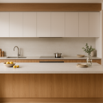
Smartstone is a quartz-based engineered stone. It gives a natural stone look with a consistent, low-porosity finish.
If you’re working from plans and want pricing, start here: Smartstone benchtops.
Smartstone colour range (what “colours” means)
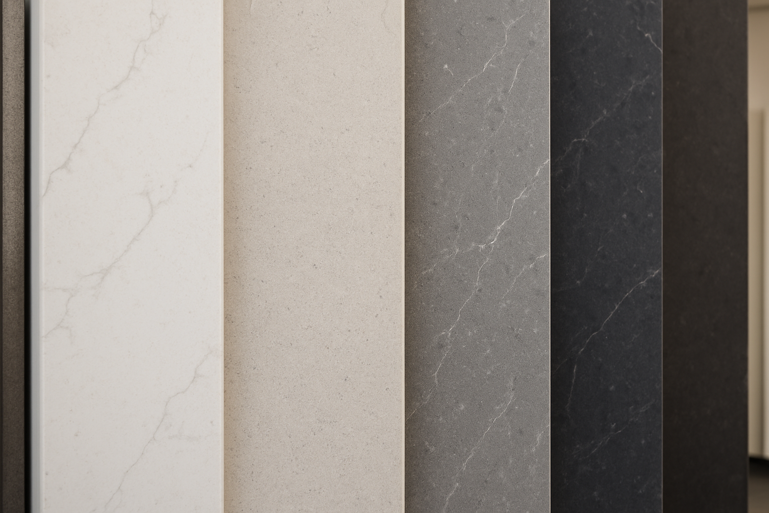
When people search “Smartstone colours”, they usually mean a mix of:
- Colour family: white, grey, beige, charcoal, black
- Pattern: plain, speckled, marble-look veining, concrete look
- Finish: polished, matte/honed, and (in some ranges) lightly textured
Smartstone colours sit within ranges/collections, and these can change over time.
Stock and lead times can also vary, especially if you need multiple slabs for a long run, a full-height splashback, or waterfall ends.
If you’re renovating to a schedule, confirm range, finish availability and lead times before you lock anything in.
Choose your colour in 3 decisions
Make these three calls first. Then choosing the exact colour is much easier.
1) Base tone (white, grey, beige, dark)
Smartstone white colours (bright, warm and off-white)
Bright whites
- Best for: small kitchens, lower natural light, crisp modern looks
- Works well with: flat-panel white cabinets, minimalist splashbacks, black handles
- Watch for: blue/grey undertones next to warm timber or warm white cabinetry
Warm whites and off-whites (cream tones)
- Best for: coastal styles, timber-heavy homes, warm LEDs
- Works well with: timber-look cabinets, white shaker doors, brushed nickel or brass
- Watch for: warm stone clashing with cool “clean white” cabinetry
Smartstone grey colours (light grey to charcoal)
Light greys
- Best for: practical, forgiving day-to-day use
- Works well with: white cabinetry, timber look, soft-grey cabinets, black handles
- Watch for: greys that swing green, blue or taupe depending on light
Charcoal and dark tones
- Best for: statement islands, high-contrast kitchens, modern layouts
- Watch for: fingerprints, dust and dried water spots under strong light
Smartstone beige and sand colours
- Best for: warm timber, classic homes, warmer lighting schemes
- Watch for: beige reading “yellow” next to crisp whites or cool grey tiles
Smartstone black colours
- Best for: strong contrast, modern kitchens, feature islands
- Watch for: dust, water spots and fingerprints (especially under downlights)
Lighting reality check (SEQ homes): bright daylight can change how whites and greys read. If you can, check your shortlist in similar light to your home.
2) Pattern movement (plain, speckle, marble look, concrete look)
Plain or fine speckle
- Clean, consistent look
- Often suits compact layouts (like galleys)
- Helps balance busier cabinetry profiles (like shaker doors)
Marble-look (Carrara style)
- A popular choice for “Carrara Smartstone” searches
- Gives movement without the porosity of natural marble
- Works well with: white shaker + black handles, or timber-look cabinets + black hardware
Concrete and industrial greys
- Works well with: handleless cabinets, black hardware and darker appliances
- Check undertones so it doesn’t pull green or brown next to tiles and grout
Rule of thumb: the bigger your island (especially with a waterfall end), the more you’ll notice pattern scale and repetition.
3) Finish (polished vs matte/honed vs textured)
Finish changes how the colour reads and how it looks day to day.
Polished
- Reflects more light (helps lift darker kitchens)
- Often shows fewer fingerprints than matte
- Can look deeper/richer as light moves across the surface
- Watch for: glare in strong sun or under bright downlights
Matte / honed
- Softer look with less glare
- Can make whites and greys feel more muted
- Watch for: oils, hand marks and water spotting (especially on darker colours)
Textured (selected colours only)
- Reduces reflections and adds character
- Watch for: residue building up in texture around the cooktop zone
If you’re torn:
- Lots of windows and bright daylight? Matte/honed often feels calmer.
- Mostly downlights at night? Polished can help the room feel brighter.
How to check undertones properly
Undertones are why two “similar” whites can clash.
Do this before you commit.
Quick undertone test (10 minutes)
- Bring your cabinet sample (door or colour chip) and tile sample.
- Check the stone in daylight and under warm and cool light.
- Step back 2–3 metres so you’re seeing it like you will every day.
- Compare next to your sink and tap finish (chrome, brushed nickel, gunmetal, matte black).
If you’re comparing Smartstone with Caesarstone or Essastone, this test usually makes the choice clearer.
You can also browse other options via our stone range if you’re still shortlisting.
Undertones and LED lighting (common in SEQ homes)
LED temperature can change what you thought you were buying:
- Warm LEDs (2700K–3000K): can make cool whites look creamier and pull greys warmer
- Neutral LEDs (~4000K): often the most balanced for checking undertones
- Cool LEDs (5000K): makes whites crisper/colder and can bring out blue undertones
Natural light matters too:
- Morning/evening light can warm beiges and soften greys.
- Midday light can make whites look brighter and reveal grey/blue/cream undertones.
Veining vs speckle: what hides crumbs, joins and marks better?
Pattern affects how forgiving your benchtop feels, especially in the main prep zone.
Veining (marble-look, including Carrara styles)
- Helps disguise joins/seams because your eye follows the movement
- Can hide crumbs and small marks better than flat tones
- Vein direction matters for waterfalls and full-height splashbacks
Speckle (fine or medium)
- Very practical for everyday use
- Breaks up small marks and crumbs
- Usually reads more consistent across the kitchen
Planning tip: bold veining can look great on a big island. In a small U-shape or tight galley, it becomes the main feature.
Popular Smartstone colour directions (and what they suit)
Ranges and names change. Use these “direction” checks instead of chasing a specific name.
Clean white kitchens
Good match for:
- Flat-panel white cabinets
- Light timber floors
- Minimal splashback detail
- Black handles and simple pendants
Watch for:
- Warm lighting can make cool whites feel stark at night.
Soft coastal kitchens (warm whites, cream and beige)
Good match for:
- Warm whites and sand tones
- Timber features
- Brushed brass or brushed nickel
- White shaker cabinetry
Watch for:
- “Warm white” varies between paint, cabinets and stone. Compare samples side by side.
Carrara look (Carrara-style Smartstone colours)
Good match for:
- White cabinets (shaker or flat)
- Timber-look cabinets with black handles
- Most floor tile colours
Practical tip:
- On long runs, very uniform veining can look repetitive. View full slabs if you can.
Modern grey kitchens
Good match for:
- Two-tone cabinetry (white uppers, grey lowers)
- Black handles, black sinks, black cooktops
- Concrete-look tiles
Practical tip:
- Check the grey against your flooring and grout in daylight.
Dark statement benchtops (charcoal and black)
Good match for:
- Large islands (including waterfall ends)
- High-contrast kitchens (white cabinets + black hardware)
Practical tip:
- Dark tops show dried water spots once lights hit them. Plan for quick wipe-downs.
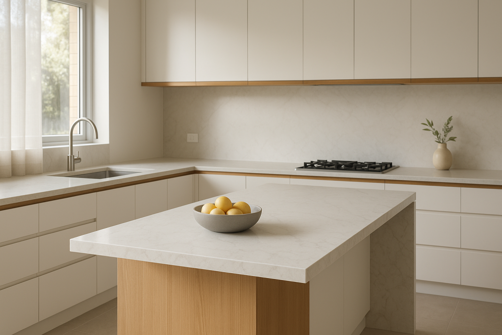
Where each colour works best (island, perimeter, splashback, waterfall)
A colour can look perfect on a small sample, then feel like “too much” across multiple surfaces.
Island benchtops
- Islands can carry bolder looks (dark colours and strong veining)
- Check pattern scale on big islands
- Pendants create shadows and bright spots, changing how veining reads
Perimeter benchtops
- This is the daily work zone (sink, bins, prep mess)
- Lighter whites/greys and subtle movement often feel calmer and more forgiving
Splashbacks (tile vs glass vs stone)
- Tiles: flexible, cost-effective, easy to change later
- Glass: smooth and easy to wipe; colour choice shifts the whole kitchen tone
- Stone (same slab): clean look, but pattern matching matters more
Waterfall ends
A waterfall makes the colour and pattern more visible.
- Dark colours look striking with light cabinetry
- Bold veining can look premium, but needs careful alignment
- If the pattern is busy, consider one feature surface (waterfall or full-height splashback)
Coordinating cabinets, splashbacks and floors (quick guide)
Bring choices together early so you’re not fixing clashes later.
Cabinet colour pairings
- White cabinets: works with almost everything. Match undertones (cool with cool, warm with warm).
- Timber cabinets: often suits warm whites, beiges, and many Carrara-style whites.
- Black cabinets: usually best with light stone for contrast.
- Coloured cabinets (greens/blues/greys): keep the benchtop undertone simple. Subtle whites/greys are a safe start.
Splashback coordination
- Strong veining in the stone? Choose a simpler tile.
- Plain stone? A feature tile can add interest.
- Glass splashback? Match the tone to the stone undertone.
Flooring and wall undertones
- Warm timber floors suit warm whites, creams and beige-based stones.
- Cool concrete-look tiles suit cool whites and grey-based stones.
- Wall paint “white” can be warm or cool and will shift how the stone looks at night.
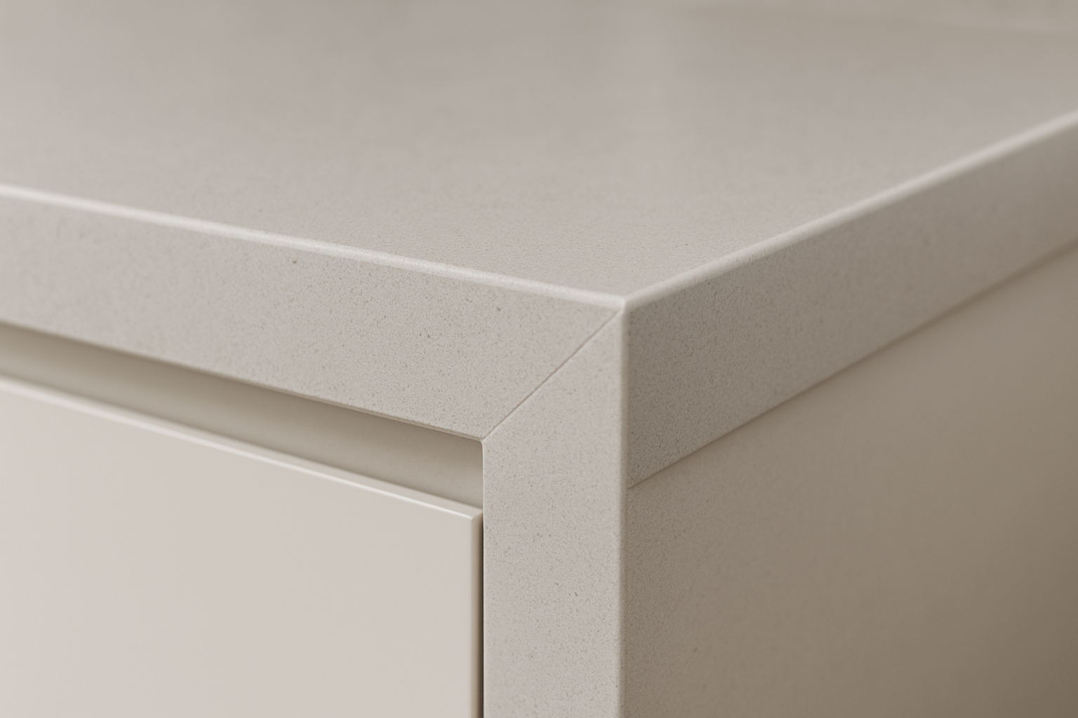
Smartstone thickness: 20mm vs 40mm (what you’re really choosing)
Thickness changes the look more than most people expect.
20mm
- Clean, modern profile
- Works well with waterfall ends
- Often suits galleys and smaller U-shape kitchens
40mm look (usually a mitred edge)
- Heavier, more traditional or “premium” look
- Suits larger kitchens and wide islands
- Balances taller overhead cabinets and bulkier rangehoods
Edge profile (quick guide)
- Square edges suit most modern kitchens.
- Small arris or pencil-round edges soften the corner (helpful for kids and high-traffic walkways).
If you send your plan, we can recommend thickness and edge profile for the layout.
Slab variation (and why small samples can mislead)
Engineered stone is consistent, but not identical.
Marble-look designs can vary slab to slab and batch to batch, and a small sample won’t show the full pattern scale.
What we recommend:
- View full slabs where possible
- Check lot/batch numbers if you need multiple slabs
- For feature looks, approve vein layout for islands, waterfalls and splashbacks
This is also where planning pays off: join placement, orientation and vein flow are easier to get right before fabrication starts.
If you’re choosing from interstate (for example, “Smartstone Melbourne”)
If you’re shortlisting remotely:
- Request clear photos and videos of the actual slabs (indoor light and near a window)
- Confirm the batch/lot across all slabs needed
- Book a viewing where possible (or ask someone local to view)
Tip: camera white balance can make warm whites look cooler (and vice versa), so try to get natural light footage.
Seams and joins (don’t leave this to the last minute)
Long runs often need joins.
The goal is to place them where they look intentional and sit in lower-visibility areas.
Common join locations:
- Near a cooktop cut-out
- At logical breaks in cabinetry
- Away from main sight lines where possible
Veining and speckle usually hide joins better than flat colours.
Strong directional veining needs extra planning, especially on islands with waterfall ends.
Maintenance and stain resistance (the reality check)
Smartstone is low-porosity and more stain resistant than many natural stones.
It’s still not indestructible, and day-to-day habits matter.
Simple care that keeps it looking good
- Wipe spills early (especially oils, coffee, wine and sauces)
- Use a soft cloth with mild detergent
- Use cutting boards
- Use trivets or heat pads for hot pots and appliances
What shows more (choose honestly)
- Dark colours: dust, crumbs and dried water spots
- Matte/honed: fingerprints and oil marks (especially on darker colours)
- Polished: glare/reflections under strong downlights
For most busy kitchens, mid-tone whites/greys with subtle movement are the easiest to live with.
Comparing brands while you shortlist
It’s normal to compare Smartstone with other engineered stone brands.
The goal is the same: get the right undertone, pattern style and price point for your kitchen layout.
Browse by brand:
Alternatives to Smartstone
If you like the Smartstone look, Caesarstone, Essastone, Lithostone, Ambassador Stone, YDL Stone and WK Stone all have similar directions across whites, greys and marble-look designs.
SEQ Stone can help you compare like-for-like, then quote the best fit for your layout, finish and timeline.
What affects price and lead time
Colour is only one part of the quote.
These also change cost and timing:
- Total bench size (island length matters)
- Cut-outs (undermount sink, cooktop, drainer grooves)
- Edge detail and 20mm vs 40mm mitred edges
- Splashbacks and waterfall ends
- Access for install (stairs, lifts, tight hallways)
A common workflow is:
- Measure/template once cabinetry is installed and secure
- Fabricate after final selections are confirmed (including sink model and tap holes)
- Install once everything is ready
If you’re on a tight schedule, flag it early.
A shortlist process that works
If you’re stuck between options, do this in order:
- Pick 2–3 colours only
- Confirm your cabinet colour (and door profile) and floor tile
- Decide 20mm or 40mm look
- Choose a finish
- Check undertones in daylight and under your planned lighting
- View the full slab where possible before fabrication
Ready for a quote on Smartstone kitchen benchtops?
If you want pricing and clear next steps, SEQ Stone can help from selection through to install.
Send us:
- Your plan (PDF is fine) or rough measurements
- Your colour shortlist
- Photos of the space (wide shots help)
- Your suburb (Gold Coast, Brisbane, or wider SEQ)
You can view options via SEQ Stone, browse the project gallery, or start with Smartstone benchtops to request a callback.
FAQs
What are the most practical Smartstone colours for busy kitchens?
Mid-tone whites, light greys and marble-look patterns with movement are popular for busy homes.
They tend to hide crumbs and day-to-day marks better than a pure flat white, especially across long perimeter runs.
Is a Carrara Smartstone look a good idea for a family kitchen?
Yes.
Carrara-style veining suits most cabinetry trends (white shaker, timber look, black handles) and helps disguise small daily marks.
Match the vein scale to your bench size, and plan vein direction for waterfall ends.
What finish should I choose: polished or matte/honed?
Polished reflects more light and is often easier to keep looking even day to day.
Matte/honed reduces glare but can show fingerprints and oils more readily, especially on darker colours.
Choose based on your lighting plan and how forgiving you want the surface to be.
How do warm vs cool LEDs change Smartstone white and grey colours?
- Warm LEDs (2700K–3000K) can make whites look creamier and pull greys warmer
- Neutral (~4000K) is the most balanced
- Cool LEDs (5000K) can make whites look crisper and emphasise blue undertones
Do Smartstone benchtops come in 20mm and 40mm?
Yes.
20mm is standard. A 40mm look is usually made with a mitred edge, depending on the design.
Do you supply and install Smartstone in the Gold Coast and Brisbane area?
Yes.
We’re based on the Gold Coast and work across Brisbane and South East Queensland, handling supply, fabrication, delivery and installation.
Related reading: SE-O-HEALTH-1GqAd7

Leave a Reply
Want to join the discussion?Feel free to contribute!