Caesarstone colours: how to choose the right shade for your kitchen benchtop
Caesarstone colours: how to choose the right shade for your kitchen benchtop
Choosing Caesarstone colours is easiest when you focus on three things: undertone, light, and pattern. Get those right and the rest falls into place.
If you’re in Newcastle NSW, don’t choose from photos alone. Coastal daylight can make whites look cleaner (and sometimes cooler), while shaded kitchens can make the same “white” look creamier or greyer.
Quick answer: how to pick the right Caesarstone colour
Use this simple order:
- Match undertones (warm, cool, or neutral)
- Test in your kitchen lighting (day and night)
- Choose a pattern level (quiet vs feature)
- Confirm the finish (matte or polished)
- View a full slab if the design has movement or veining
What is Caesarstone (and why colour matters)
Caesarstone is an engineered stone (engineered quartz) used for kitchen benchtops, bathroom vanities, and sometimes splashbacks.
Colour matters because:
- It’s usually the biggest visible surface in the kitchen
- It sits right next to cabinets, splashback, paint and flooring (undertones show quickly)
- A small sample can look different to a full slab, especially with veining or speckle
Caesarstone colour families (quick shortlist)
Start with a “family” so you’re not comparing dozens of near-identical shades.
- Whites: bright and clean (can look stark under warm LEDs)
- Off-whites/creams: softer and warmer (great with timber)
- Greys: cool to neutral (works with modern palettes)
- Beiges/greige: bridges warm and cool finishes
- Blacks/charcoal: dramatic, but lighting and fingerprints matter
- Concrete looks: mottled, modern, suits minimalist kitchens
- Marble-look veined designs: subtle to bold statement veining
- Speckle/terrazzo patterns: practical and good at hiding crumbs
If your kitchen already has strong features (busy splashback, heavy timber grain, statement lights), a quieter benchtop often looks calmer. If cabinetry is simple and flat-front, you can usually go with more movement.
Undertones: warm, cool, and neutral (how to choose)
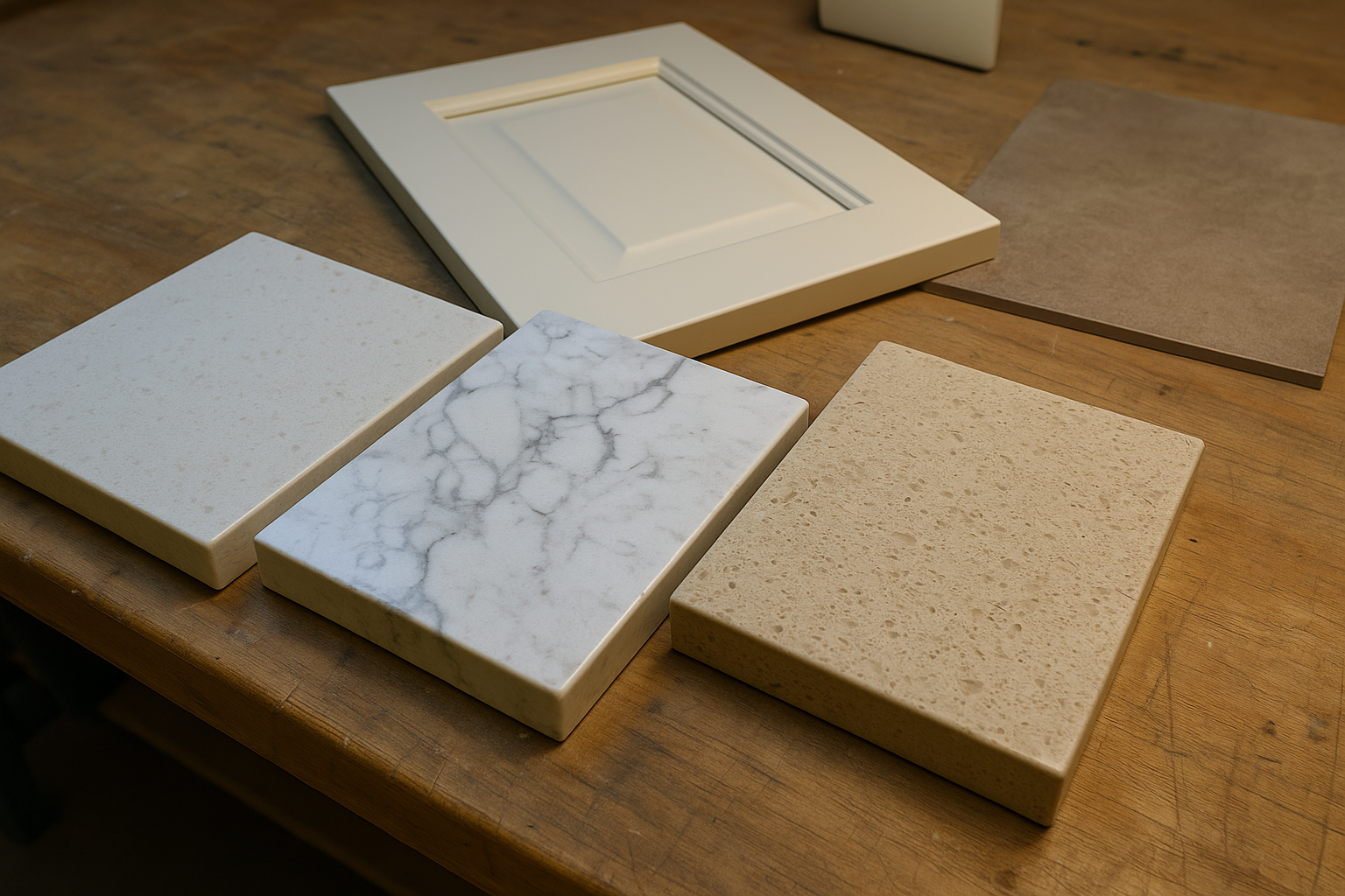
Compare samples beside cabinetry and flooring before you lock in a colour.
Before you commit to a name or a photo, work out the undertones already in your kitchen.
- Warm undertones: cream, beige, honey, warm taupe
- Cool undertones: blue-grey, crisp grey, charcoal, steel
- Neutral undertones: balanced whites and greige that sit between warm and cool
Warm kitchens (what suits)
Warm Caesarstone colours suit:
- Timber cabinetry
- Brass or brushed gold tapware
- Warm white lighting
- Sandy or cream tiles
Warm tops help stop bright whites looking “blue” under warm lights. They also suit older Hunter homes where you’re keeping timber or warmer flooring.
Cool kitchens (what suits)
Cool Caesarstone colours suit:
- Crisp white or grey cabinets
- Chrome, stainless, or black tapware
- Concrete-look floors
- Cooler daylight
Cool tones look sharp and modern. If your downlights are very warm, test samples at night so the space doesn’t feel clinical.
Neutral kitchens (the safe option)
If you’re mixing warm and cool finishes, go neutral.
Good options include:
- A balanced (true) white
- Light greige
- Soft marble-look quartz with gentle veining
Neutral colours also help when you’re choosing finishes at different times (for example, cabinetry is locked in but flooring isn’t).
Pattern: veining vs speckle/terrazzo (and how “busy” it feels)
Pattern is style, but it’s also practicality. It changes how clean or busy the kitchen feels day to day.
Veining (marble-look styles)
Veining can lift a simple kitchen, especially on an island.
Check:
- Vein scale: bold veining can dominate smaller kitchens
- Vein contrast: higher contrast looks more dramatic (and more trend-led)
- Slab layout: plan where veins land, especially on waterfall ends
If your kitchen needs two slabs, ask how the pattern will run across joins.
Speckle/terrazzo patterns
Speckle and terrazzo-style patterns are popular because they’re forgiving.
- Crumbs and smudges are less obvious
- They suit most cabinet styles
- They tend to look “neat” between wipes
If you’ve got kids, pets, or a high-use kitchen, this is often the lowest-stress choice.
Marble-look quartz vs concrete-look quartz
These are two of the most common “modern kitchen” directions.
Marble-look quartz
Marble-look quartz gives a classic, high-end look with simpler upkeep than natural marble.
Best when:
- You want a feature island or waterfall
- Your cabinetry is simple and the benchtop is the hero
- You’re comfortable planning joins and slab layout early
The bolder the veining, the more important layout becomes around the sink, cooktop, and waterfall panels.
Concrete-look quartz
Concrete-look quartz feels modern and architectural.
Best when:
- You like a muted, matte-leaning look
- You have black hardware or minimal profiles
- You want movement without strong “vein lines”
In darker kitchens, mid-tone concrete looks can feel grounded without going too gloomy.
Finish: matte vs polished (what to expect)
Finish changes both the look and daily feel.
- Polished (gloss): bright and quick to wipe, but shows reflections and glare
- Matte/honed equivalents: softer and reduces glare, but can show touch marks on some colours
- Textured: adds depth (often suits concrete-look styles)
If you have lots of daylight or downlights, matte can reduce glare. Make sure you test the finish around the sink and main prep zone.
Thickness: 20mm vs 40mm (including edge build-ups)
Thickness changes the whole style of the kitchen.
- 20mm: clean and modern
- 40mm: heavier and more statement
A common option is 20mm with a 40mm edge build-up on the front (and ends if needed). It gives the thicker look without making everything bulky.
Confirm early what your cabinetry is designed for. Clearances around appliances and panels can change.
Edge profiles (eased, pencil round, bevel, waterfall)
Edge details can shift the look more than you expect.
Common edge profiles:
- Eased edge: modern and minimal
- Pencil round: softer and slightly more classic
- Bevel: more definition, can suit traditional cabinetry
A waterfall end runs the slab down the side of an island. If you’re choosing veining, confirm the waterfall layout before sign-off.
Slab variation: why you should view full slabs
Even within the same colour name, slabs can vary.
What can change by batch/lot:
- Vein placement and intensity
- Speckle distribution
- Overall movement and shading
- How warm or cool the base reads
If the colour has noticeable movement, view a full slab (or the largest sample available) before final approval.
Caesarstone ranges and names can change over time, so confirm availability and discontinuations.
Lighting: LEDs and natural light direction
Lighting changes Caesarstone colours more than most people expect.
What shifts colour:
- Natural light direction: south-facing looks cooler; north-facing warms tones
- LED temperature: warm, neutral, and cool LEDs can change whites and greys a lot
- Glare: polished finishes reflect downlights and can look brighter
Newcastle homes often have bright coastal daylight, then warm lighting at night. That day-to-night change is where undertones show up.
If your final LED temperature isn’t locked in, avoid choosing a colour that only looks good under one light.
Cabinet colour checklist
Your benchtop should work with the full palette.
- White cabinets: choose a white with a clear undertone, or add gentle veining/speckle for separation
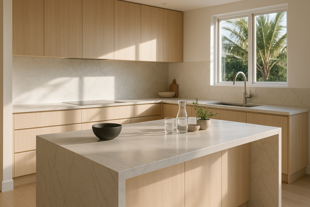
- Timber cabinets: off-whites, creams, warm greige, terrazzo-style speckle
- Black cabinets: whites with contrast or bolder veining (check reflections)
- Greige cabinets: neutral whites, greys, and concrete looks
If possible, compare against a real cabinet door or offcut, not just a small chip.
Splashback choices (tile vs glass vs stone)
Splashbacks can make the kitchen feel cohesive or overly busy.
- Tile splashback: easiest visually, can be calm and timeless
- Glass splashback: clean and reflective, but can shift how whites read
- Stone splashback: premium look, but can feel busy around power points and cut-outs
If your benchtop has bold veining, a quieter tile often works best.
Maintenance: stain resistance and heat precautions
Engineered quartz is low maintenance and stain resistant, but it’s not indestructible.
- Wipe spills early (especially oils, spices, wine, coffee)
- Avoid direct heat (use trivets, don’t place hot pans on the surface)
- Use chopping boards and don’t drag rough items
- Use gentle cleaners (avoid harsh chemicals and scouring pads)
For hiding water spots and fingerprints, mid-tone colours and gentle movement are usually easier than pure white or near-black.
Fabrication and installation (templating, joins, cut-outs, lead times)
Great results come from good planning.
Key points:
- Templating: usually happens after cabinets are installed and levelled
- Joins: plan locations so they’re discreet
- Cut-outs: confirm sink, cooktop, tap holes, and drainer grooves early
- Overhangs: island seating may need extra support
- Lead times: slab supply and fabrication schedules affect timing
Renovation order usually goes: cabinets installed → templating → fabrication → install → other trades finish around it.
Don’t choose under showroom lighting only
Showrooms help you shortlist, but they don’t replicate your home.
Do this instead:
- Take a sample home
- Check it morning, midday, and night
- Put it next to cabinet and flooring samples
- View it flat and upright
Place it near the cooktop area too. That’s where glare, reflections, and marks are most noticeable.
Comparing brands while you decide
It’s normal to compare Caesarstone with Smartstone and other brands for colour, finish, availability, and budget.
Helpful pages:
- Caesarstone®: https://seqstone.com.au/caesarstone/
- Smartstone: https://seqstone.com.au/smartstone/
- Lithostone: https://seqstone.com.au/lithostone/
- Essastone: https://seqstone.com.au/essastone/
- YDL Stone: https://seqstone.com.au/ydl-stone/
- WK Stone: https://seqstone.com.au/wk-stone/
- Ambassador Stone: https://seqstone.com.au/ambassador-stone/
If you have a specific colour name, send it through and we can help you compare the closest available match.
What affects price and lead time
Pricing depends on the job details, not just the slab.
Main cost drivers:
- Total square metres (including islands)
- Cut-outs (sink, cooktop, tap holes)
- Edge profile
- Waterfall ends and panels
- Joins (often needed in larger kitchens)
- Access for install (stairs, tight entries, crane needs)
To get a clear quote and timing, send:
- Your plan (PDF is fine)
- A few photos
- Your suburb
- Your expected cabinet install date
A simple shortlist method (fast and low-stress)
If you’re stuck, narrow your options like this:
- Choose one warm, one cool, and one neutral
- Pick one pattern lane: plain, speckle/terrazzo, concrete-look, or marble-look
- Compare them at home beside your cabinet and floor samples
- Remove anything that looks wrong at night
- Decide: quiet (low pattern) or feature (bold movement)
Three options are easier than thirteen.
Newcastle NSW note: choosing for local homes (and getting help)
Newcastle kitchens often get strong daylight during the day and warm downlights at night. That swing makes undertones more obvious.
If you want help with supply, measuring, fabrication and installation, see: https://seqstone.com.au/newcastle/
Ready to choose? We can supply, cut and install
If you’re planning Caesarstone kitchen benchtops in Newcastle and surrounding areas, we can manage the full job: supply, measure, fabrication, delivery, and install.
To get a quote from SEQ Stone:
- Send your plans and a couple of photos
- Share your preferred Caesarstone colours (or your top 3)
- Tell us if you want 20mm, 40mm, or a 40mm edge build-up
- Note any cut-outs (sink/cooktop) and whether you want waterfall ends
Start here: https://seqstone.com.au/caesarstone/

Good fabrication starts with accurate measuring, cut-out planning, and edge detail.
FAQs
Do Caesarstone colours look different in warm LED light?
Yes. Warm LEDs can make whites look creamier and soften greys. Cool LEDs can make some whites look sharper or slightly blue. Always check samples under the LEDs you’ll use at night.
Which Caesarstone colours hide crumbs and daily mess best?
Mid-tone whites, greige, and gentle speckle/terrazzo patterns tend to hide crumbs, smudges, and water marks better than flat bright white or near-black.
Is matte harder to maintain than polished?
Not always. Matte can show touch marks more on some dark or very flat colours. Polished is usually faster to wipe, but it shows reflections and glare more.
20mm vs 40mm—what’s the difference in the finished look?
20mm looks slim and modern. 40mm looks thicker and more statement. A common compromise is 20mm with a 40mm edge build-up on the front.